

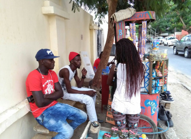
Since November 2017, our application Jang is in pilot phase with a dozen street vendors in Dakar. This is an opportunity for us to revisit the design process, development and launch of this mobile app and share the realities of this project that began more than a year ago. Interview with Ndèye Fatou Faye and Pierre Hervé Berdys, the project managers of Jang:
Hi Fatou and Pierre! Nakamu? So what is Jang? Where did the idea come from?
The idea came as a result of a Human Centered Design study on coffee, credit and fruits vendors conducted last year to learn more about their daily life, their problems and uses of technologies.
The study shows that merchants faced many problems, the main ones being NOT the lack of formalization and financial management, but rather:
- lack of recognition;
- boredom;
- lack of information and contents in their mother tongue;
- the desire to learn English;
- lack of bargaining power.
Moreover, beyond needs directly expressed by vendors, our research shows (and we question this hypothesis regularly) that they have trouble:
- to plan ahead and to be inspired;
- and therefore to learn new skills to develop themselves.
We also think that many among us do not want to develop the business they currently run because they see it as a temporary job.
After several sessions of brainstorming and prioritization of ideas, we’ve decided to work on an application to inspire and train street vendors: Jang was born.
Where did you start?
We draw our inspiration from what already existed in learning applications and methods, to see what worked and what did not work … That is learn from the mistakes of others to avoid doing them again. A small comparison of existing solutions, their advantages and disadvantages, etc. was then made.
We later tried to structure the idea as simple as possible with some first workflows and wireframes. The workflows have been used to place the major features in coherent paths and the wireframes have made it possible to visualize the layout of various elements on the screens. To go faster, we did not to linger at all on the appearance (look & feel) at first. You just had to produce some draft ideas to start with and then organize and structure everything.
Once our first wireframes were made via the interface design software Sketch and afterwards in a clickable prototype form with Marvel, we tested them with some street vendors. During these tests, it is necessary to explain to the vendor what would happen in reality. The application is hollow (which means that the prototype is not linked to a database), we must explain what would happen in reality, which can seem a little frustrating because at this stage of the project what we offer is minimal . As a result, you feel very uncomfortable and everything is still a little confused. But it’s at that moment that you can learn a lot and start making first choices. It is relevant to test your concept very quickly, because by trying to make the perfect application, you can often miss many little things. And it’s better to realize them earlier rather than invest time and money and at the end have to move back.
Interesting, and what did you learn from these tests?
Between what we saw and what the vendors do see, there was a significant difference. We noticed that merchants were clicking everywhere, even on the text. We realized we really had to simplify our interface by deleting text and leaving only a few clickable components. Also, vendors did not understand well the menu first and the different contents, that is the reason why we then added an “audio help” icon on each page. Another aspect difficult to see when you are at office is that when the vendors use the application, they are often right in the sun making part of our application almost illegible because it lacked contrast!
Few improvements later, we went back to test the new prototype and, this time, found that the audio help button was quickly recognized by the vendors, it was the button on which they very often clicked first! And no need to explain to them the functionality of the button, they imagined that an audio was going to start. We then decided to use this audio button as a main component in the application.
And after that, what did you do?
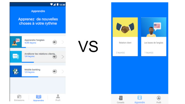
We took a look at the graphical design of the application (User Interface Design): what would it look like in its style, colors, fonts, illustrations, etc. Complete screens were made but we knew that the UI design of our application would change further.
Finally, we have collected these screens and detailed all the features in a quite simple specifications of dozens of pages. The purpose of this document is to enable developers to understand the functioning of the application and to make specific technical and financial offers.
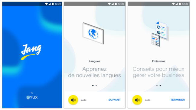
The first screens of Jang’s onboarding
How did you choose the developers with whom to work?
It’s never easy, but the most important thing is to work with trustworthy and available people. At this point, you don’t even know if your app will work so don’t worry too much about technical skills — step up with people with listening skills and who will be able to evolve their codes (and their budget) according to the progress of your application.
How was the collaboration with the developers?
Very good! A sprint system with a backlog was set up to prioritize features and pages that developers had to create first. The backlog consists of several simple features that we classified in prioritical order (major/minor). This allows us to have a first product with essential features and to do real tests quickly.
It is also important to meet regularly the developers to follow the integration of the design (particular attention paid to the size of icons!) and to answer the questions newly raised during the development. The main technical challenges were related to the choice of the loading mode of the content (with the app from the beginning/ streaming in real time/ downloaded as the use of the app) and the video player (youtube or hosting on our servers).
How was the content creation and what were the main difficulties? What results do you have?
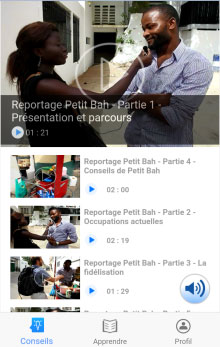
The challenge was to create a very simple and comprehensive content for the vendors — and also at a lower cost for us for this pilot phase. We first approached some of them who, thanks to their rich career, were likely to inspire their colleagues and then did video interviews either in French, Wolof or Pulaar. We also created a mini English course with standard phrases to use during a sale. We started on a serie of illustrations with an audio file, saying the word in Wolof, then in English. Another customer relationship module has been created in the same way.
To go faster, we decided not to use audio and video providers and did everything ourselves! Report: content creation is a business apart! It must be outsourced if it is not the added value of your company. This will make you save valuable time and get focus on your relationship with your target. As a result, we have subsequently forged partnerships with some complementary content providers (radios, NGOs, etc.).
How was the launch of the app? Has it been well adopted?
With the prototype design of the app, we had already gone to see the vendors to collect their feedback. This first contact was very beneficial because even if at this stage the application was not functional, the idea got a favorable welcome on the part of vendors. Most of them had besides participated in our UX study few months earlier and were delighted to see that there was a follow up.
As for adoption, it’s the hardest part of Jang’s process. We initially prepared a training session in Customer Relationship and English. We then took the list of vendors from our base and called each one of them. The purpose was to invite them and tell them what has been done since the study. Convincing them was not that easy and only a handful of them came. We had hoped from this training to introduce them to the application and then make them the Jang’s Ambassadors.
So we set up a field strategy based on several visits to reach our target and establish a relationship of trust with them. Once they grab the application, we leave them to share it with their entourage by word of mouth being that their community is tightly knit.
We have also recruited a speaking Pulaar person, because even though most of street vendors understand Wolof, exchanging in their native language serves to create a real trusting environment.
What are the next steps for Jang and the priorities for the next 3 months?
Currently, we plan to make the application well-known to street vendors in order to understand them better. This is for us a perpetual search project based on a mobile application. Since an application does not have to be static, we will do more and more content to avoid people growing tired of it quickly. For the first quarter of 2018, we hope to reach more than two hundred users.
Finally, if the first study allowed us to highlight a number of personas (typical profile), the multiple field trips made us discover new ones that we ignore until then. So we are updating our personas and thinking about Jang’s features again.
The launch of Jang finally allowed us to identify some particularly enterprising Street vendors with whom we would like to test other concepts … To be continued!